
Learn how the StoryBrand framework transforms product landing pages by focusing on clear, compelling storytelling. This article dissects the framework with actionable steps and demonstrates its effectiveness with real-world examples.
Article overview:
- Introduction and need for the StoryBrand framework
- Elements of the StoryBrand Framework and how to apply each to designing landing pages
- Five-section landing page formula that incorporates all StoryBrand elements
Storytelling: The reason why some landing pages hit the mark and others don’t
Ever wonder why some product landing pages turn visitors into raving fans while others flop? The key lies in clear communication that highlights your product’s solution. But it’s not as simple as it sounds — picking and choosing among numerous compelling features to convey via just one webpage can be overwhelming.
So here’s the secret: the StoryBrand framework by Donald Miller simplifies messages and helps businesses create winning landing pages.
It revolves around effective marketing structured like a compelling story, incorporating seven key elements: a hero (the customer), a problem, a guide (the brand), a plan, a call to action, failure consequences, and success transformation.
Think of your favourite movies, like Star Wars or The Hunger Games, and you’ll notice this pattern in all the plots.
Successful brands, including Nike and Apple, also seem to incorporate the same framework into their marketing strategies. Nike’s “Just Do It” campaign positions the brand as a guiding force, empowering customers to overcome obstacles and achieve their goals.
Apple’s ads present its products as ideal vessels for its customers, empowering users to explore creativity and connect through music, art, and personal relationships.
StoryBrand’s 7 elements and how to apply them to landing pages
1. The Hero
Remember, customers, and not the brand, are the main characters. Make your target audience feel important by identifying and empathising with them through your communication on the landing page.
Use direct language that speaks to their needs and pain points. Personalise the content by addressing them directly using “you” statements.
2. The Problem
Demonstrate that you clearly understand the challenges customers face. Use concise and direct language to articulate the problem your product or service solves.
Ensure your problem resonates with your target audience’s emotions and experiences — show empathy by acknowledging the challenge they face without your solution.
3. The Guide
Position your brand as the mentor to the hero with the solution to their specific problem. Showcase your expertise and authority in the industry through testimonials or endorsements.
4. The Plan
You’ve got the visitor’s attention; what’s next? Elaborate and break down your solution into simple steps or stages that outline how customers can achieve their desired outcomes using your product or service.
Use bullet points or numbered lists to make the plan easy to follow and understand. Describe clearly the benefits or results customers can expect at every stage.
5. The Call to Action
Potential customers love your product offering and want to take the next step. Make it straightforward for them by using a compelling and clear call to action (CTA) that prompts immediate engagement or purchase.
Make the CTA prominent on the landing page, using contrasting colours or buttons to attract attention. Use action-oriented language that creates a sense of urgency or excitement, such as “Start Now,” “Get Your Free Trial,” or “Join Today.”
A CTA button on a sticky banner that remains visible as visitors scroll will also promote continuous visibility and immediate engagement.
6. The Success Story
Illustrate how the customer’s life will improve with your solution. Share success stories, case studies, or testimonials that showcase real-life examples of customers who have benefited from your product or service.
Use specific details and metrics to quantify the results and demonstrate the tangible benefits customers can expect. Emphasise the transformation or positive outcomes achieved by using your solution.
7. The Failure
Highlight the consequences of not taking action. Remind visitors of the risks or missed opportunities they face by not choosing your product or service.
Use subtle language that underscores the negative outcomes or challenges they may continue to experience without your solution. Position your offering as the proactive choice that prevents these negative consequences.
Copy this StoryBrand landing page design formula
During my 2021 internship at ShopBack, I used StoryBrand to revamp the landing page for the ShopBack Button, doubling the “Download Now” CTA’s click-through rate. I also applied it in my UX Design portfolio project for Healthy365. I used a five-section landing page formula that incorporated all seven StoryBrand elements, which I will share in the following case study.
Background of the Healthy365 landing page redesign project
The Singapore Health Promotion Board’s (HPB) mobile application, Healthy365, is a well-known app among Singaporeans, but it has a landing page that’s ineffective in garnering interest.
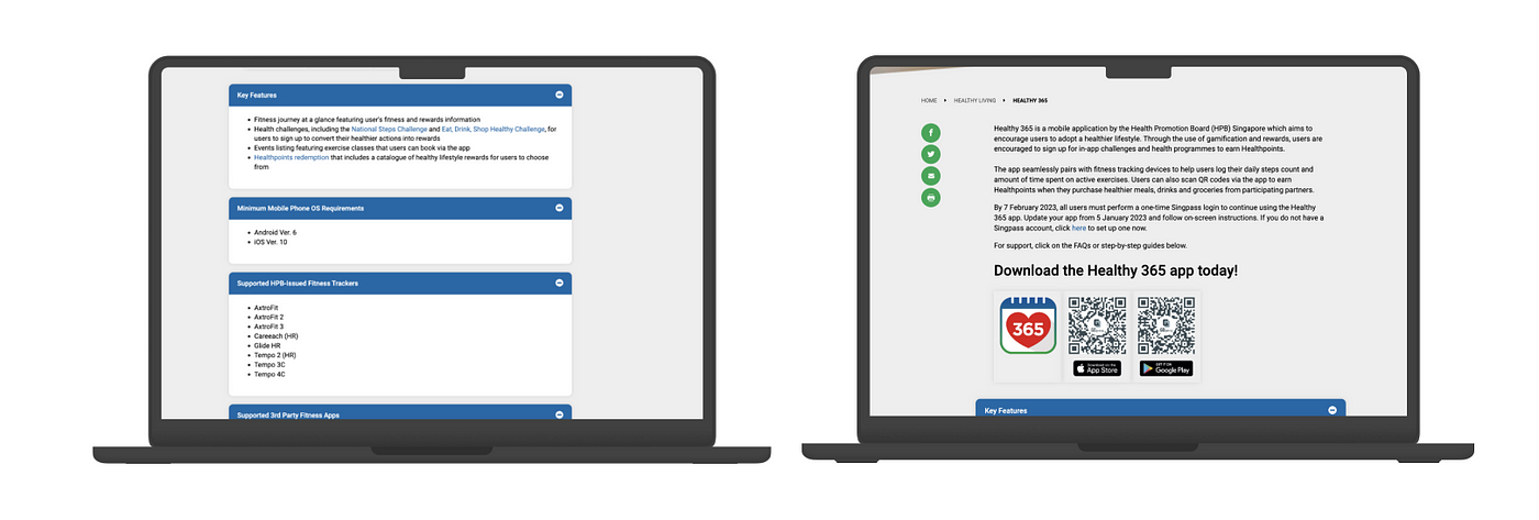
Its original landing page does not reflect the app’s modernity and does not highlight its monetary Unique Selling Point (USP). When we skimmed through the page, nothing about the app’s monetary rewards stood out, even though they were the key appealing factor for its users.
The wordy information overload and the dull design also hamper the motivation for users to download the app. The page looks more like an article, a form of content that works against the short attention span of visitors expecting to see easily digestible information on why they should download the app.
However, redesigning the page with StoryBrand made it 55% easier for visitors to identify the app’s USP and 114% more persuasive in getting visitors to download. Check out the sections of the new webpage below:
Section 1: Seize the hero’s attention with the header

The header of a landing page is the most important. It helps visitors decide whether to continue scrolling, and it is here where you can incorporate a few components of the StoryBrand to pique their interest.
1. Headings: to summarise the problem and solution in a catchy way
Having a clear problem statement will help you word your headings. However, the main heading should be about your appealing solution rather than the problem you’re solving, so that visitors can remember your product’s offering even after exiting the page.
ChatGPT is helpful if you need to wordsmith your solution into a simple catchphrase. A/B testing is also highly recommended to identify which variation of your copy or design generates the best conversion rate.
In your supplementary heading, mention the problem explicitly. You can also phrase it as a rhetorical question to engage visitors emotionally and enhance persuasion. In addition to the problem, elaborate on your solution here with a short sentence.
2. Success metrics to establish your brand’s credibility
Build up your credibility with some relevant statistics about the impact of your product on existing customers. This helps visitors know what positive results they can expect from your solution.
I incorporated the metrics into this section to minimise the length of the webpage, but feel free to create a separate section if that provides more emphasis and relevance within your business context.
3. CTA button
Provide immediate follow-up for visitors to take action after realising their problem and learning about your solution. Remember to use action-oriented verbs.
4. Image of product
This gives visitors an idea of your product’s appearance, so they may also visualise themselves using it.
Section 2: Showing the hero your plan with the how-to section
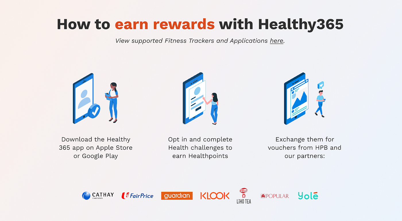
This section shows how exactly your product delivers the solution to its users. You can do it in 3 easy steps, like I did here.
Keeping it simple is key because you want to convey to potential customers that only minimal effort is needed to get what they want through your solution.
Providing relevant visuals is also helpful in communicating how your product works.
Section 3: Introduce your notable partners to enhance credibility
To keep the landing page brief, I also attempted to insert the logos of the brand’s notable partners in the same how-to section. It is also relevant to place them in this section since their partners provide the rewards Healthy365 users earn through the app.
However, if it is more impactful or appropriate for you to have a separate section that introduces your brand’s partners, place them in another cut.
Section 4: Help the hero envision success with testimonials
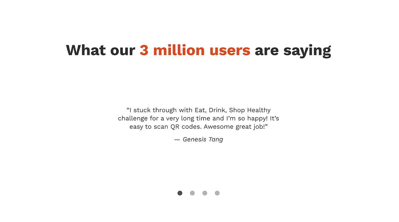
Stressing your solution’s success through customers’ testimonials boosts trust in your role as the guide and helps potential customers envision the benefits they’ll enjoy.
Inserting relevant metrics here also strengthens your case. For example, I mentioned the high number of users Healthy365 has in this section to communicate its popularity.
Section 5: End strong with a call-to-action
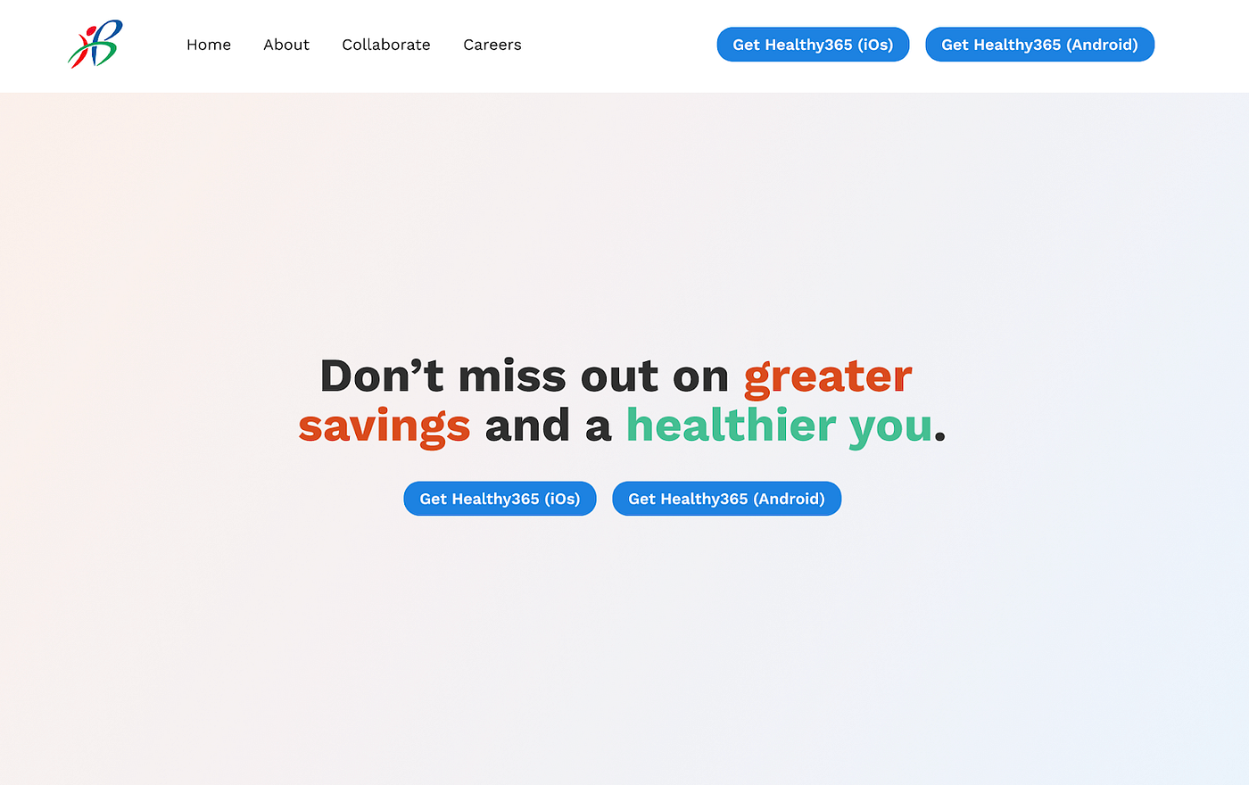
Finally, you want to end the story with a clear direction for the hero. You can use a verb-oriented phrase to prompt visitors to get your product.
Or, you can tap into their FOMO and remind them to take action if they don’t want to miss out on the benefits of your solution.
Reminder: It is also essential to have a sticky banner with the CTA button so visitors can make the move no matter which part of the landing page they’re at.
Elevate your landing pages with StoryBrand Principles today
Optimising your landing page with the StoryBrand framework makes it much simpler to significantly boost conversion rates and overall marketing effectiveness.
By centring your messaging around the customer and presenting a clear, compelling narrative for them, you make it easy for potential customers to see the value of your product. Embrace the StoryBrand principles today and watch your conversion rates soar!

Leave a comment